Cupping Calc: A Small Bet That Paid Off
https://polerizer.github.io/cupping/
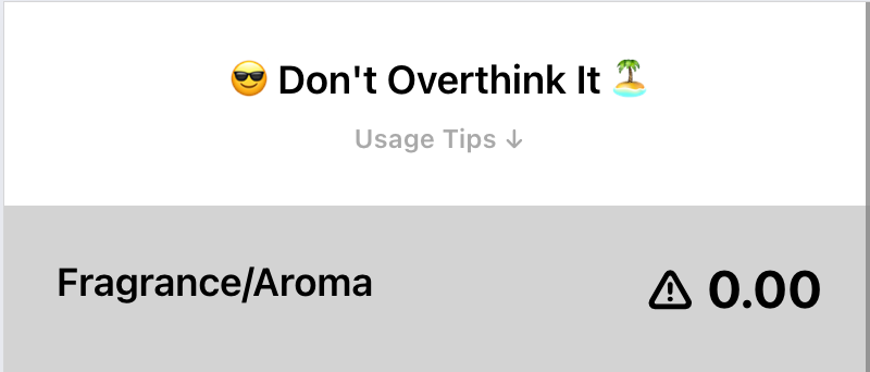
It's designed for mobile, so it'll look weird on desktop.
I got into tech because I enjoy the feeling of being able to solve problems myself, without needing to wait for other people to shrink-wrap and sell a solution to me. When it actually works out that way, it feels validating: I have a problem, I write a program, and now I have two problems I have the tool I needed to solve the problem. It's nice when it's a technical problem, but it's even better when it's something I can use "in real-life" – my own small contribution to a world that feels right.
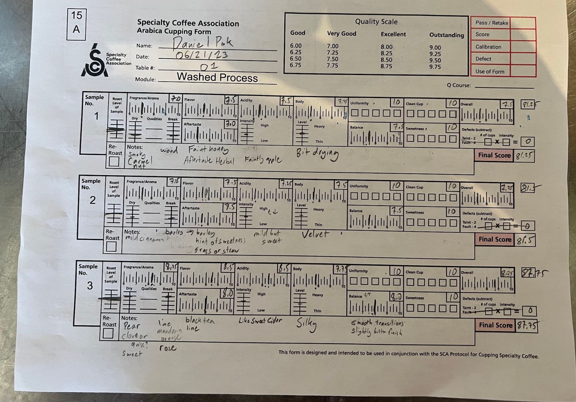
Last summer, when I was doing coffee training at Boot Coffee, I got frustrated by the process of totaling up scores when grading coffee. The process is called "cupping", and I have a more detailed description of the how and why of cupping in my posts about the class. The short version is that cupping is the process of grading the quality of a coffee, and it requires adding up ten sub-scores that include qualitative assessments of the coffee across seven dimensions and technical assessments of the coffee against three sets of criteria. When cupping formally like you do for the class, you have to use the traditional paper form, which captures qualitative descriptions of the coffee in addition to the scores. However, to get certified at the end of course, you have to demonstrate that you can cup coffee accurately within time constraints. The process of adding up all ten sub-scores under pressure, while you think about and adjust them, was stressful for me. It's too easy to make an arithmetic mistake, and you really don't want to get dinged for clerical errors.
Clear goals and hard time constraints are an excellent way to get minimum viable products (MVPs). I had two weeks of courses: week one was more introductory, week two was advanced. There wasn't much room for error in the second week; I'd have to have my tools and approach dialed in by the end of the first week. So by Thursday of week one, I realized that if I wanted to build something, I'd have to do it that night and test it the next day.
When I got back to my hotel, I got to work. I built a prototype with Typescript, React Native, and React Native Web – a combo that's worked well for me for prior web/native projects. For ease of distribution, I wanted to put it on the web so my classmates could try it, but for future-proofing, I used React Native in case I wanted to convert it to a native mobile app in the future.
If you want to play with it for yourself, you can do so here:
Note that it's designed for mobile, so it'll look weird on desktop.
Walkthrough
Here's a walkthrough:
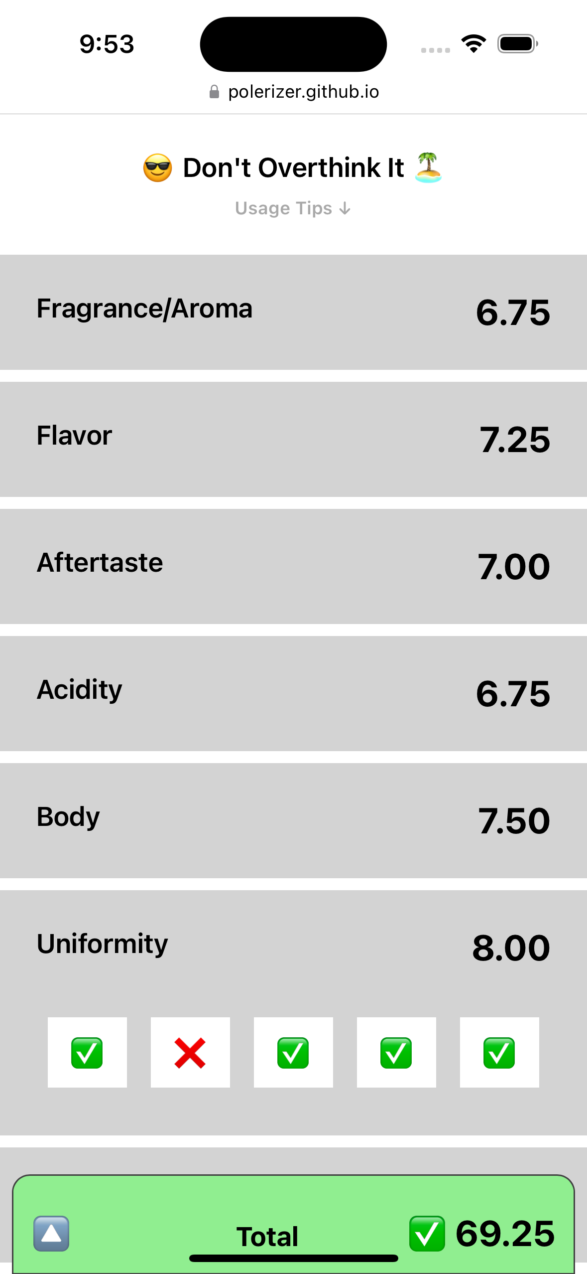
- Each of the categories is listed in order.
- Scores in the qualitative categories go in increments of
0.25from6.00to9.75, so to pick a score, select a major digit (6,7,8, or9) and then select a fractional component (.00,.25,.50, or.75). As a shortcut, you can double tap the major digit to set it to.00(e.g. Tap8and then8again to set it to8.00). - Each time you finish entering in a sub-score, that section will collapse to help you focus on the ones you still need to enter, but you can tap on a section at any time to re-open it.
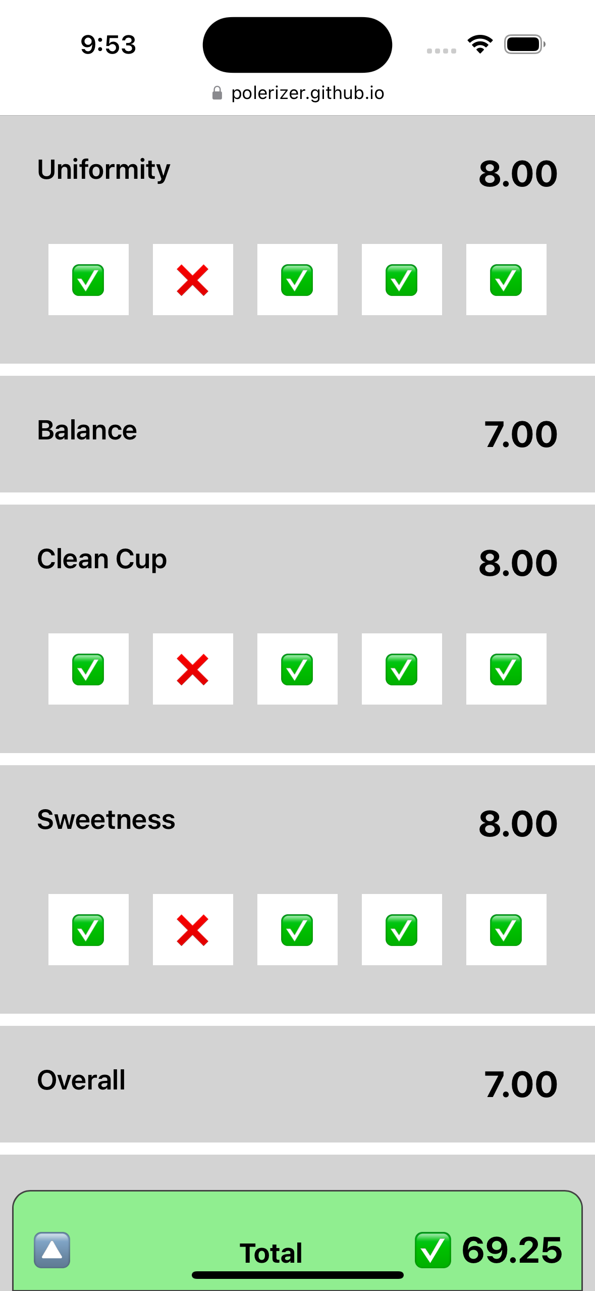
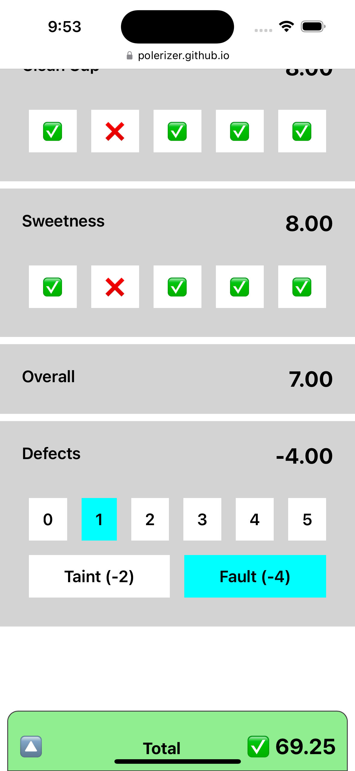
- For the technical categories, a coffee starts with full points (10 in each) and loses 2pts for each cup in the set of five that fails to meet the criteria for that category. These categories start off collapsed by default since most high quality coffees will not have any failing cups. If you do need to mark a failing cup, tap on a category to expand it, and then tap on the "✅" corresponding to the cup that failed to change it to a "❌" (noting which cups had defects is important in cupping).
- If there are defects (cups failing in any technical category are defective), tap the "Defects" section to expand it, select the number of cups exhibiting defects, and then select the severity of those defects (i.e. "Taint (-2)" or "Fault (-4)").
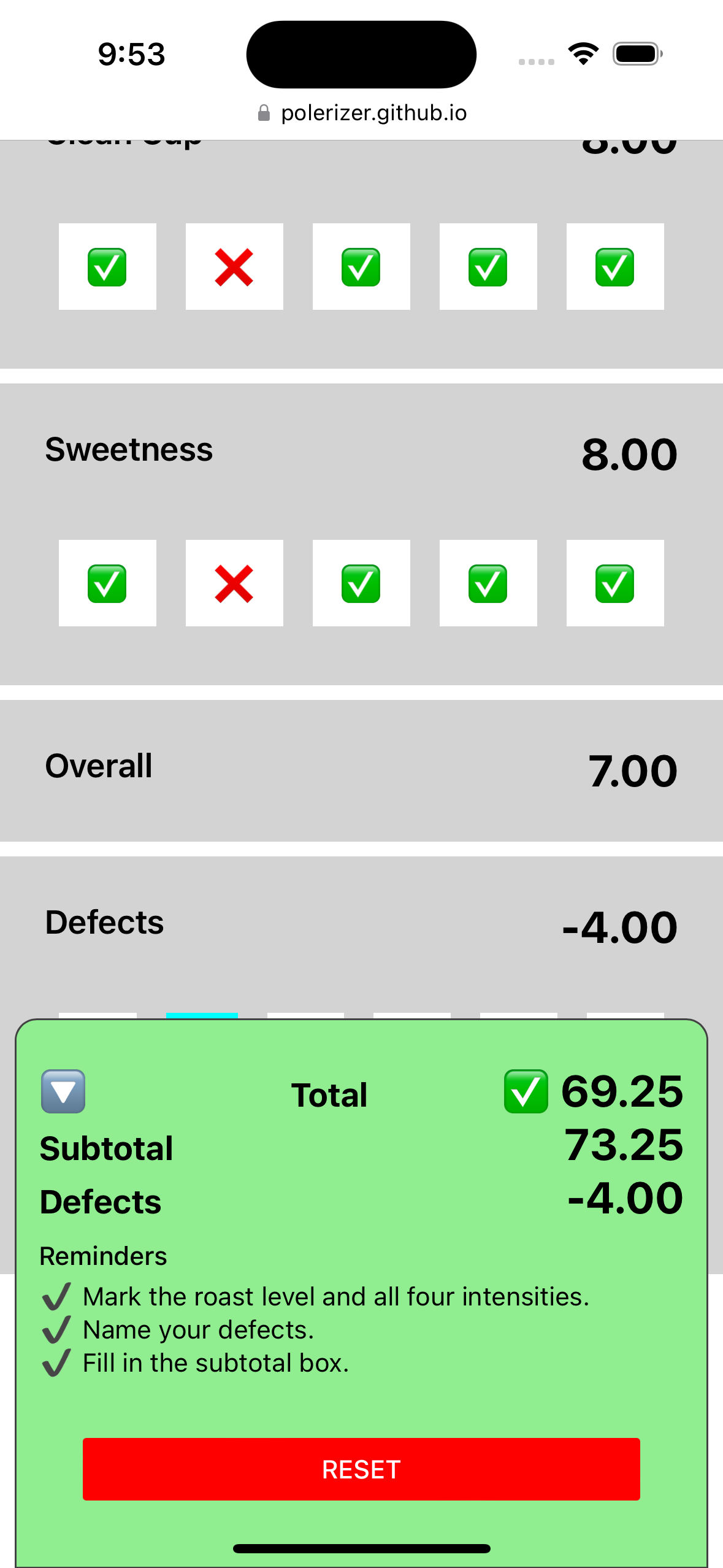
- The bottom sheet labeled "Total" keeps track of your score so far and includes a "⚠️" if there are sub-scores that haven't been filled in. Tap on the bottom sheet to expand it. The expanded view includes the subtotal and defect penalty, matching the way the paper form expects you to show your work.
- There's a "Reset" button at the bottom of the "Total" bottom-sheet to quickly reset the form. You can use this between samples during a cupping session instead of having to refresh the page.
- If you need a refresher on this, there's a "Usage Tips" section right under the header that you can tap to show some help text.
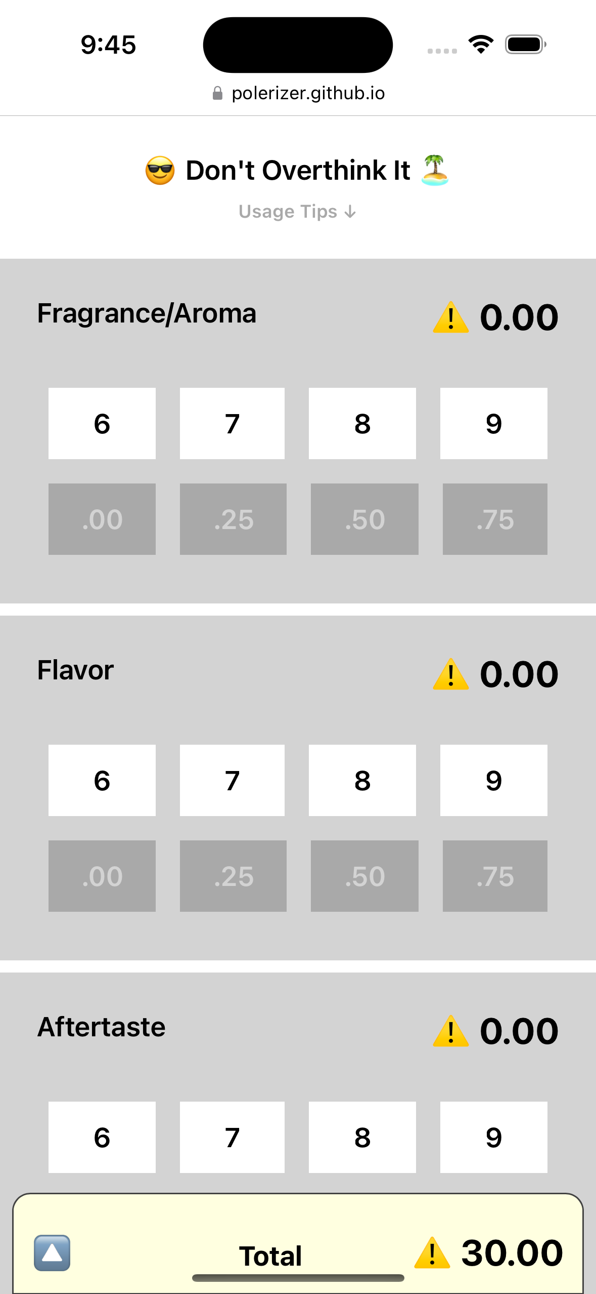
Screenshots from the app.
What It Doesn't Do
- It doesn't store any data persistently. Once you refresh the page or hit "Reset", all data is lost. It's a calculator, not a cupping data platform. There's no backend. This is intentional since I wanted to keep it as simple as possible to get the MVP done in time for me to use, and to reduce the risk of errors during the high-stakes second week of classes.
- It doesn't store qualitative descriptors about the coffee (e.g. flavor notes). It's just meant to replace a traditional calculator for summing up the sub-scores on the sheet. It isn't meant to replace the actual cupping form the way that some digital cupping tools do. This is because it was built for my needs as a coffee student, where we were tested on using the paper cupping form.
- Teach you how to cup coffee. I put in a couple tips in the "Totals" bottom-sheet based on the most common feedback we got in class, but other than that, it's not meant to explain how cupping works. It assumes that you're learning from someone qualified, and are just using the app to add numbers.
Design & Iteration
While the app looks really rough, I'm proud of getting it done fast enough to not only use, but iterate on and share with my classmates. Here are some of the considerations and changes I made throughout that process.
- "Brutalist" design. I didn't have time to make it pretty, so I indexed on usability. The visual style I went with is simple and closely reflects the underlying components. I did it out of necessity, but I think it's in the vein of "brutalist" web design, where a website's UI components stick closely to their raw HTML elements. I suck at picking good colors, so there are very few colors. I used brightness and size to indicate hierarchy: major digit selectors are brighter white since they're more important, decimal part selectors are a darker share to de-emphasize them, and the contrast between them provides a rhythm to the page that makes it easier to scan. The scores have a larger font size and more space around them to make them jump out. Color mostly comes from emojis, and they have very straightforward meanings: green is good ("✅"), red is bad ("❌", Reset button), and yellow is warnings ("⚠️").
- Polishing the score selector. My thought process went like this: the most naive score selector is a textbox that limits inputs to numbers, but we know that there are only sixteen possible values so it'd be better to show them visually for the user to tap instead of having to type it in ("recognition vs recall"). The sixteen possibilities could be laid out as a grid so it only takes one tap to pick a value, but a 4x4 grid has too many options – giving each a suitably large tap target would make the component too big, which would make it harder to scan the page and keep context on the task. The major and minor axes of that grid (major digits vs decimal parts) are independent, so we could compromise and create a solution that takes two taps instead: one for the major digit, and one for the decimal part. It's one more tap, but since the user is already thinking of the score as "seven plus zero-point-five", the second tap has minimal mental cost, and overall improves the usability over a big grid.
- Double-tap to select
.00. After a day of testing the app in class, I realized that keying in round numbers like8.00was un-ergonomic because the.00option was all the way on the left edge of the screen, requiring me to move my thumb horizontally (and shifting my grip) to do so. I tried making it so that when you select a major digit, it defaults to.00, but this interrupted the flow in two ways: first, the section wouldn't auto-collapse if you didn't explicitly pick.00again since it didn't know if you were done keying in that score, and second, it meant that some scores now took one tap and others took two. When keying in ten scores, you want to make sure you didn't miss any, so the rhythm of each score taking exactly two taps provided important feedback which this change would break. I went home that night and tried something else: if you tap the major digit twice, it selects.00for you. This felt good in testing. It solved the ergonomic issue of having to move my finger across the screen, but preserved the rhythm of having exactly two taps per score. Usability testing FTW! - Keeping things in the same order as the paper form. In my first iteration, I put the three technical categories ("Uniformity", "Clean Cup", and "Sweetness") at the end of the list, after the final qualitative category, "Overall". I put them at the end because most coffees don't have issues that require docking points on the technical categories whereas every cup must be scored in the "Overall" category. I thought it would be more streamlined to keep the less-used categories further down and collapsed by default. However, when I tested it, I found it confusing. When I keyed in the scores from my sheet, I'd do it in the same order as I saw it on the form, so having the app in a different order broke my flow. The core emotional pain-point the app solves is alleviating the fear and stress of adding up my sub-scores incorrectly or too slowly, so I was very concerned about accuracy. I'm likely to go box-by-box on the paper form to ensure that all those numbers match what I keyed into the app, and if they're in a different order it causes cognitive dissonance. I solved this problem by putting the technical categories in their normal spot, before the "Overall" category, but collapsing them by default. That way, a user can visually see that those categories are accounted for, but without it taking up any more space than necessary. Finally, I applied that principle to the "Totals" bottom-sheet by putting "Subtotal" above "Defects" to match how the "Subtotal" box is vertically above the "Defects" box on the paper form.
- Tips and reminders. I knew I didn't want to put too much text into the app because the physical environment of a cupping lab is already quite busy, and the app needed to be as simple and predictable as possible. I included text in a few places that I thought aligned with the goals of the app:
- Small encouragements at the top of the app to remind me to break out of stress-mode, take a deep breath, and do my best. They include emojis to add a bit more playfulness to a stressful environment. The three snippets on top were quotes from our instructor, Valerian, and meant to project his earnest support while he was busy administering the test. You get a random one each time you refresh, and I leave it to you to go find them all if you'd like.
- Reminders of common pitfalls in the "Totals" bottom-sheet so that folks would see them when they're done adding up their sub-scores. These are things are that you should double-check before you consider the form complete for that coffee, so it makes sense to have them there from a workflow perspective.
- Help text in a collapsed section under the header. I shared this app with my classmates and I wanted them to know about some of the flow-optimizing tricks I added to the app like double-tapping to key in a round number and the "Reset" button in the "Totals" bottom-sheet.
How It Was Received
By the end of the second week, half the class was using my app to total their scores. I asked for feedback and as I recall, everyone who tried it figured out how to use it, no one found any major bugs, and several folks had feature suggestions for future iterations. It was the tool we needed, and not much more. I love the feeling of having a tool that's designed specifically for you, with your needs and quirks in mind. Even more so when it works for a community you care for, and reflects their needs and quirks too.
Some folks suggested that I expand on it to build a full-fledged cupping data platform. That would entail things like logging descriptors and flavor notes, saving data across sessions, and facilitating multiple people cupping the same coffees in a given session (e.g. aggregating their scores, etc.). I thought about it, but didn't end up pursuing it because I didn't think the market need matched what I was well-positioned to create. The main people who cup coffee are coffee roasters and coffee buyers (people who go to farms and source green coffee, not consumers buying coffee). The biggest challenge for these folks isn't adding up numbers while under time pressure. I'd guess that their pain points are things like tracking which samples they're tasting given that they may have storerooms full of green coffee samples from farms, roasted samples for QC, etc. Addressing these pain points would be better handled by people with more domain knowledge of those particular roles. Sure, I could acquire that knowledge through user research and hands-on experience, but I'm unsure that a better cupping interface would be a good wedge into that market anyway.
Ultimately, I feel like I spent the right amount of time on it. If I had spent a month building it, I would be bummed if it didn't turn into a full platform product, but instead I spent about half a day on it in total before calling a feature freeze to ensure it'd be stable, and I feel like I got really good returns for that investment.
I don't have plans to keep working on it, but if you cup coffee and want some help doing arithmetic, feel free to use it.