Pattern Making Pt 1: "Patterns"

Late last year, I designed some packaging for a collection of coffee samples I gave out to some friends. I'm not much of an artist. The best I can manage are simple illustrations of geometric things, so I used a trick I learned in the one graphic design class I took in college to stretch my limited drawing abilities into a useful art asset: turning the simple illustrations into a repeating pattern.
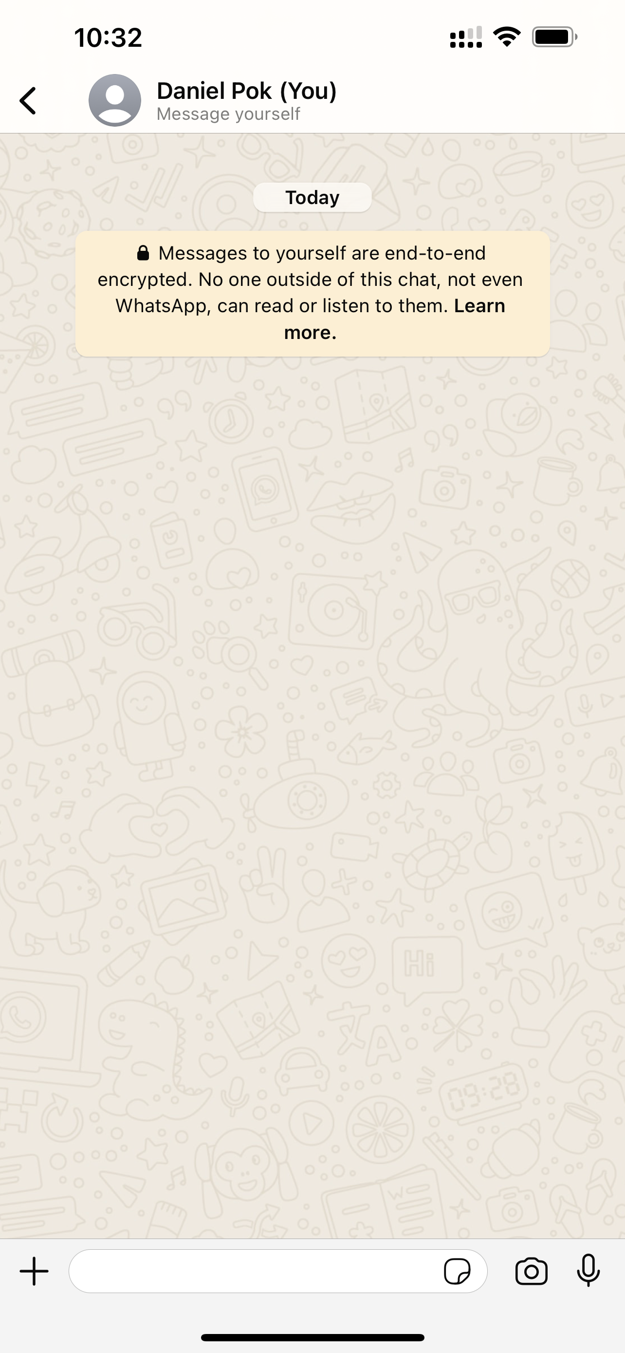
It's an approximation of a fully illustrated background image. Take, for example, the light-mode WhatsApp background: it doesn't repeat, even though it goes off the edge. I love the way it looks. The hand-drawn, line-art style reminds me of middle-school notebooks where every available space has been filled in with doodles. They take a lot of creativity and time to create – more than I have.
Have a look for yourself:
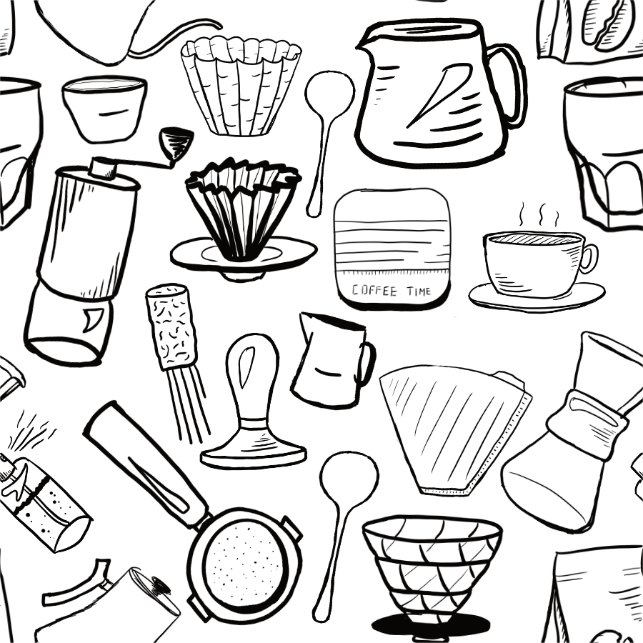
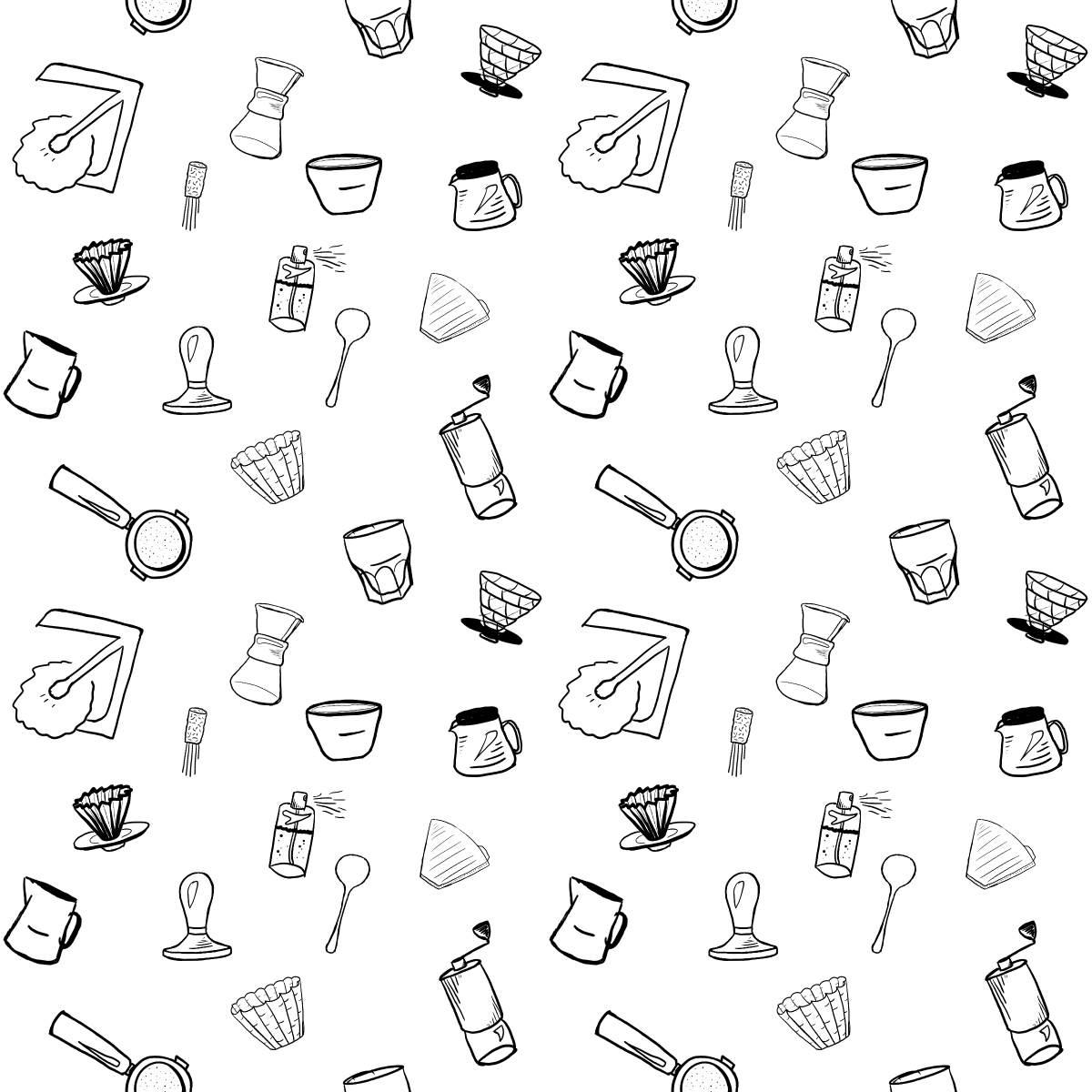
So the value of the pattern making trick is to stretch a pattern cell into a larger asset, without making the tiling obvious. This lets us emulate a full-fat illustration while drawing fewer elements. Here's the pattern on my coffee bag:
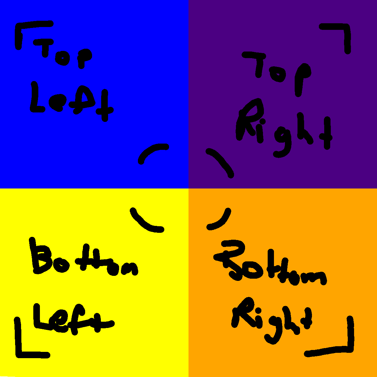
It's not hard to spot where the pattern repeats, but I think it passes the sniff test at first glance (especially if it's incorporated into a bigger design, like on the bags). The key is to break up the outline of the pattern cell. Humans are very perceptive to outlines, even if they're implied by white space (see also: all of modern web design that uses white space instead of actual lines). The pattern cell is a square, but if the art fit neatly inside that square, then the whitespace around the edges would strongly imply a tiled grid, which would make the boundaries of the pattern cell really obvious.
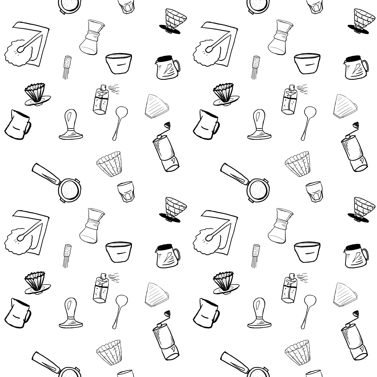
Here's the pattern cell for the pattern above:
See the trick? The elements go off the edge and "wrap around", which breaks up the outline. It might not look like it, but it uses the same technique as camouflage: by breaking up the outline of the square pattern cell, we make it harder to pick it out.
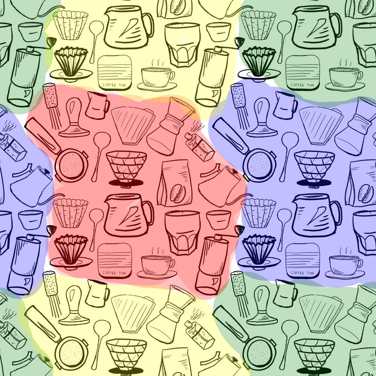
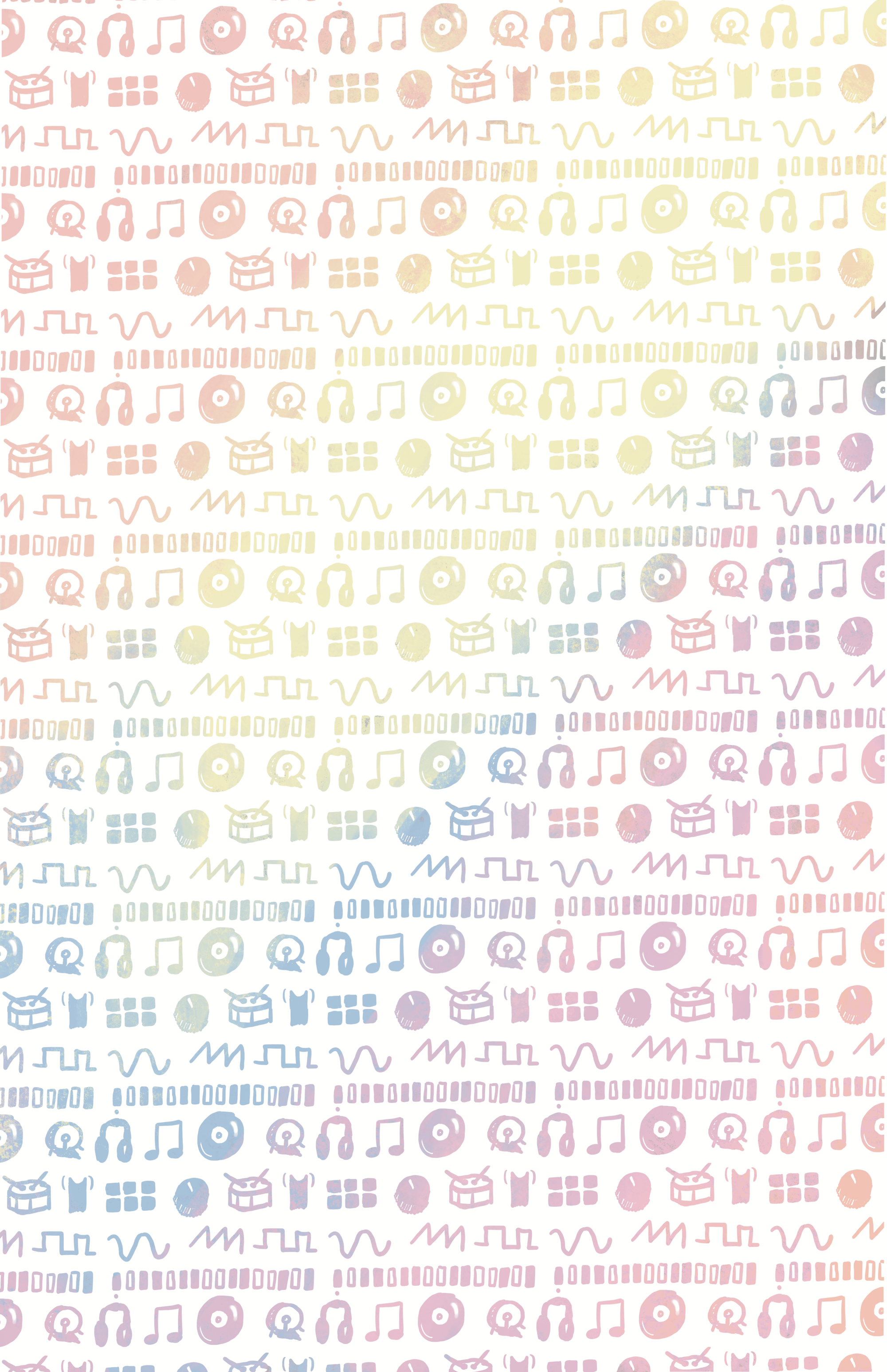
Here's the pattern again, repeated in a 2x2 grid with each set of elements highlighted:
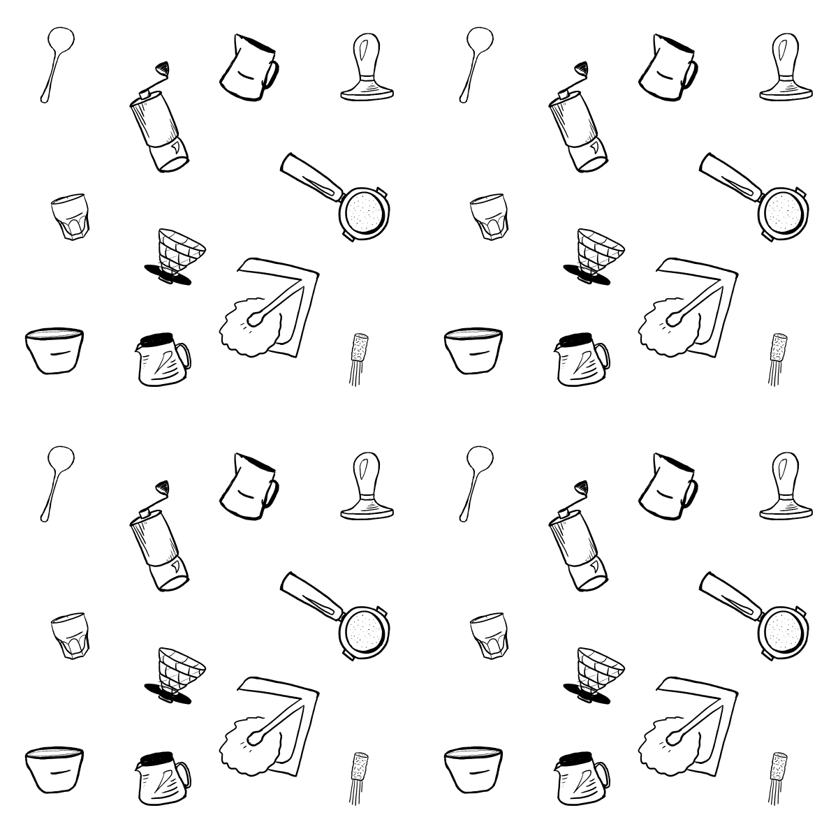
Let's try making a new pattern out of these elements. There are around 20 elements in the pattern. Here's eleven of them arranged in a pattern cell:

And now let's try that in a 2x2 pattern:
See that giant cross of white space going through the center? Even though the elements go close to the edge of the pattern cell, they never cross it, and that's enough for your brain to see the lines of white space.
Ok, "one neat trick" time: the way to easily add elements that "wrap around" is to swap the quadrants of the image such that the center is now on the sides, and then add more elements to the center. In practical terms, that means swapping the top-left quadrant with the bottom-right, and the top-right with the bottom-left. Is that hard to visualize? Let's look at some examples.
Here's the pattern cell from above, but after doing the swap I described. The cross of blank space in the center is from the blank space that used to be around the edges.

To see exactly what the swap does, I made this pattern cell with labeled quadrants. Note how after the swap, the "circle" in the center is now spread out around all four corners, and the angles in the corners are now in the center. In effect, doing this "swap" is just panning your infinite pattern from the "middle" of a pattern cell to the corner where four cells meet.
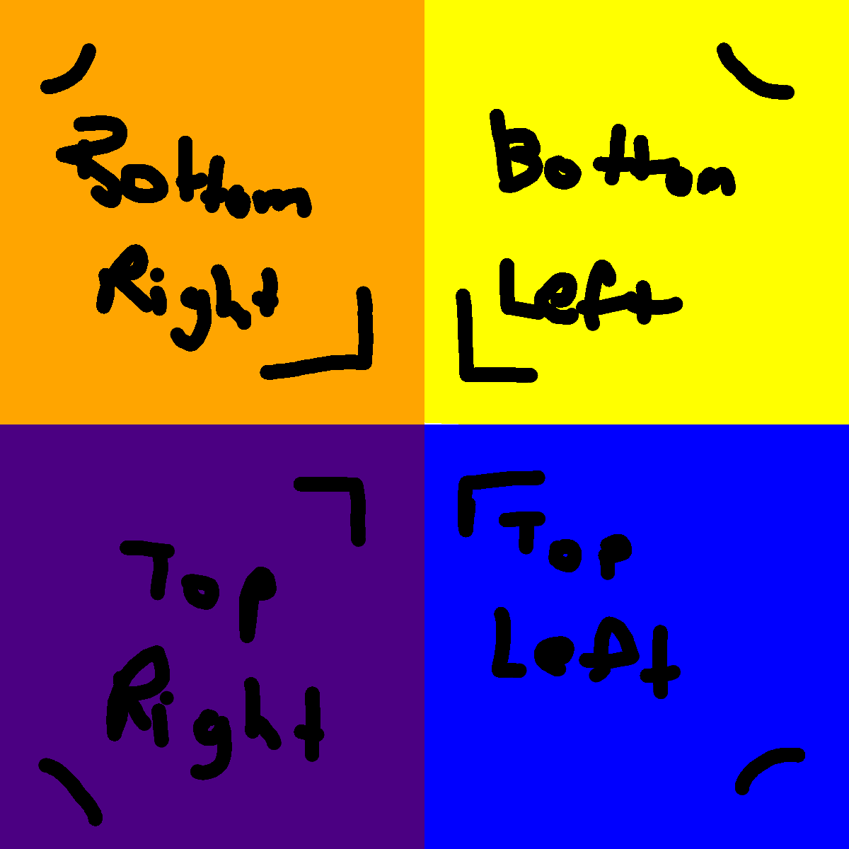
1st: Original pattern cell. 2nd: Pattern cell after swapping. 3rd: Pattern in a 2x2 grid. Notice how the "swapped" cell is the same as centering on the point where the four cells meet.
Ok, so let's try out the trick. We'll start out with the "swapped" pattern cell and then add some more elements to fill the blank space:

Let's see how that looks in a 2x2 grid:
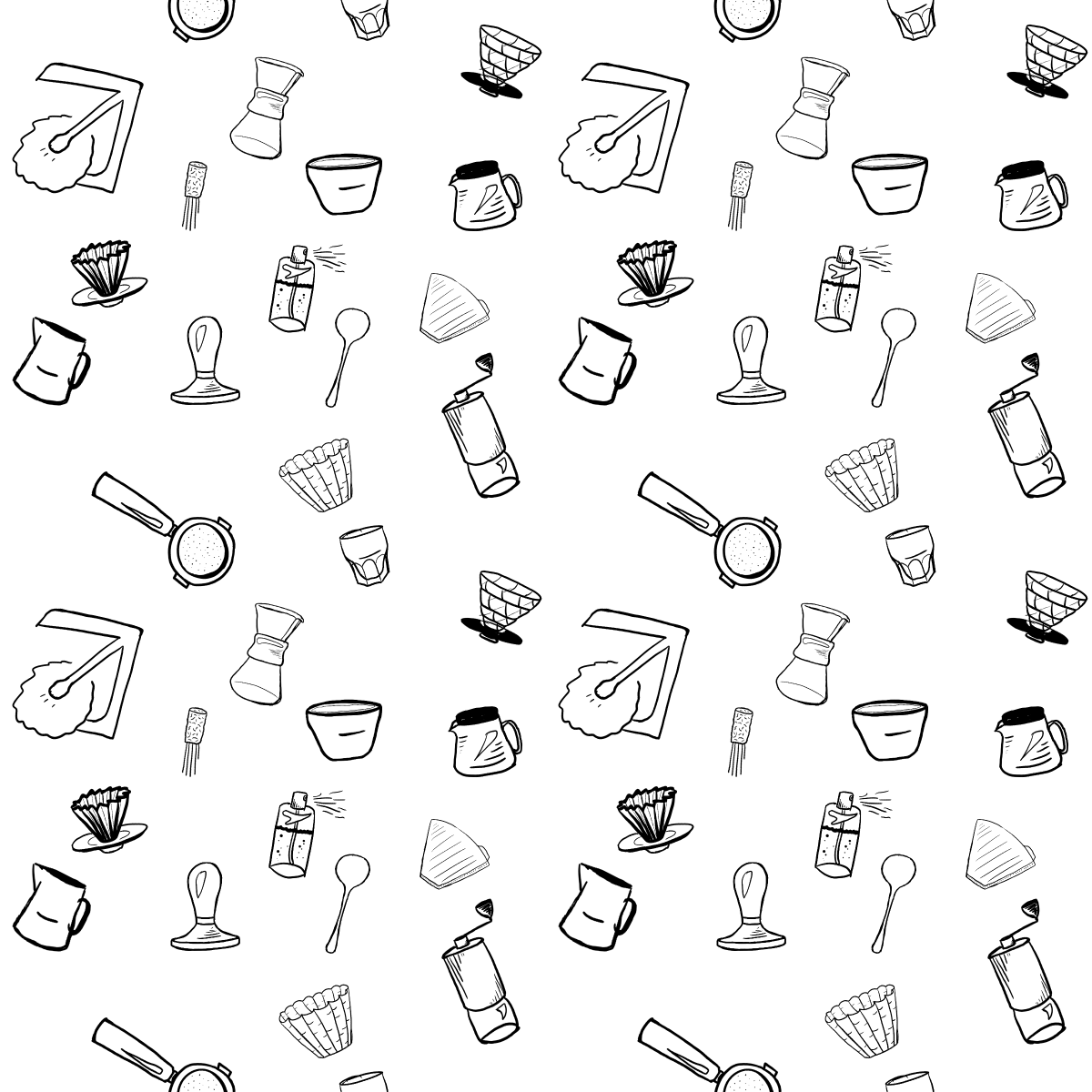
It's definitely better. The blank cross is gone, but there are still some awkward blank spaces near the portafilter (that's the 🔎 looking thing that goes in the espresso machine). It would help even more if we adjusted the positions and rotations of the existing elements to hide the seams a bit better, but that can be hard to do if you did the swap on the pixels of the image and no longer have individual element objects to manipulate.
Good thing I didn't do this in a normal image editing tool (foreshadowing much?).
Let's tweak it a bit:

And in a 2x2 grid:
It's not perfect, but it's better. Let's take a quick look back:
- We arranged the elements in a cell, trying to get close to the edges, but it the seams of blank space still stuck out after tiling it.
- We "swapped" the quadrants of the pattern cell and added some more elements in the blank space to break up the outline of the pattern cell. This produced a pattern with much more subtle seams, but there was still some awkward blank space.
- We adjusted the elements a bit to hide the blank spaces and smooth out the visual pacing.


That's the gist of it. I'm sure real artists could share some deeper knowledge about how to make visually pleasing patterns, but here are some more thoughts I had about them:
- These multi-element patterns need to start with good, consistent elements. I drew the individual elements using Procreate on my iPad using the Apple Pencil. Procreate makes it easy to achieve that hand-drawn style, but maintaining consistency between elements is up to you. Notice how some of my elements are empty and figurative while others have more detail and implied shading. Ideally, they would all be similar instead.
- Keep most elements similarly sized so that things don't stand out. When one element is a lot larger than the others, it creates a visual anchor that makes the repeating more obvious. It's nice to have a mix of sizes, but be careful when making a small handful of items a lot bigger than the others. Notice how the WhatsApp pattern uses small dots and stars as decorations, but most of the important elements are about the same size. That illustration can get away with having a few large "hero" elements because it doesn't actually repeat. The hero elements stand out, but they're unique. Similarly, watch out for elements that are darker or more colorful than others standing out too much.
- Avoid prominent parallel lines. In addition to whitespace, humans are good at spotting parallel lines. Any prominent straight line in a pattern becomes a parallel one and creates implicit outlines. Try to rotate things slightly in different directions to avoid having all straight lines in the pattern be parallel. On the other hand, leaning into the parallel lines can create some cool effects. You don't have to hide the pattern if you don't want to.
I'll leave you with a few of the patterns I've made and how I've used them:

Doing the quadrant swap manually in Procreate and other image editing tools is a pain and makes it hard to adjust things afterwards. I've wanted to make myself a better tool for this, and I finally got around to it.
In Part 2, I'll talk about that tool, how to use it, and maybe a bit about how I built it.