Can we identify good locations for a specialty cafe using data?
When my friends Mabel & Ming from Moonwake Coffee Roasters (@moonwakecoffeeroasters) told me they were looking to open a cafe, I started wondering whether we could use data to evaluate potential locations in the Bay Area that might be underserved by specialty cafes relative to their demand. Unfortunately, my experiment didn't work out, and I was unable to get good quality data that could support cafe owners in selecting a location. The good news is that Moonwake will open their first cafe in San Jose soon (later this year, fingers crossed!). Despite the lack of results, it was a fun exercise in simple data science and market research.
 Kate Bradshaw
This was my starting hypothesis:
We can use free or cheaply acquirable data to identify whether a location in the Bay Area is over- or under-served by specialty coffee cafes.
There are many new cafes opening in the Bay Area, and I think there's room for many more as we all collectively grow the market of people who appreciate specialty coffee. My hope was that we could show that with data, and help potential cafe owners identify areas where their cafes would make a big impact.
Let's jump straight to the results:
It Didn't Work Because I Couldn't Find Good Enough Data
I don't think that free or cheaply available data is capable of providing significant signal for potential cafe owners in the Bay Area, at least not in a way that's better than general-purpose market data for retail businesses. I found some market research firms that had reports about coffee, but they weren't cheap and they weren't specific.
I found national level trend data, but it's hard to apply nation-wide demographic breakdowns to a particular region. It might have been possible to look for census tracts in the Bay Area that roughly matched the demographics in the national studies, but it didn't seem like it would be high signal. I evaluated commissioning a survey, but the costs were too high for my little (unfunded) experiment:
Here's what I would've wanted to learn (though probably not in 5 questions):
- How many people brew their own coffee at home? How many brew specialty coffee from whole bean?
- How many people order pour-overs at cafes? How often?
- Which Bay Area specialty coffee brands are people aware of?
- How far are they willing to drive for better coffee?
- How much do they know (or care) about various characteristics of coffee such as where it's produced, the processing method, its flavor profile, its cupping score, roast freshness, certifications, etc.?
I was only able to source general population demographic data from the US Census (via the American Community Survey), as well as some broader market research about coffee that was freely accessible:

 SCA Staff


However, the biggest revelation for me had nothing to do with the data: finding commercial real estate for your first cafe is highly idiosyncratic. There are a million other things to consider before the size of the specialty coffee market. Despite the commercial real-estate market's current woes, it's still hard to find a suitable location for the right price. Cafes are food service facilities and need spaces that can be renovated for their plumbing and electrical needs without breaking the bank. For a small business, proximity to the owners and their community is also a critical consideration. It's unlikely that a prospective cafe owner would open their first shop on the other side of the Bay just for the specialty market. That said, this data might be more useful for picking a second location: expanding to another location requires scaling the business in ways that make some of these proximity requirements moot, and the business has more time to consider where to expand to since they have one location that can continue generating revenue in the meantime.
Okay, but what about these maps?
I built a prototype map with some heuristics for supply and demand based on the data I got from the ACS and some manual data generation:
- I used population density and the density of high-income households (>$200k annually) as proxies for demand.
- I used isochrones representing a 10-minute driving distance radius as a proxy for cafe availability.
It's a shape on the map that represents how far you can get within a certain amount of time. For example, the isochrones on these maps show how far away you can be and still drive to a given cafe within 10 minutes. The roots of the word mean "equal" ("iso-") and "time" ("chrone").
The first thing I did was cosplay as a Data Scientist and plop my data in a Python notebook via Google Colab. I came up with a list of fifty Bay Area cafes that I thought might count as specialty, manually geocoded them (got latitude/longitudes for them based on their address), used Open Route Service to generate the isochrones, and then used plotly to make the maps with Open Street Map styled tiles.
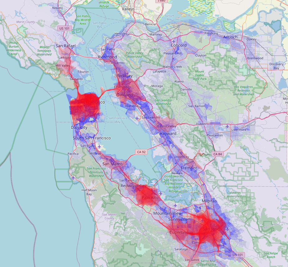
Here's what the resulting map looked like:
A couple things jumped out immediately:
On one hand, my data was really spotty. The list of cafes was incomplete, and everyone I showed the map to would ask "Why isn't XYZ cafe on this list?". The definition of a "specialty" cafe is also vague and varies from person to person. I thought that fifty cafes would be a large enough sample, but in places where there are few cafes, the inclusion or exclusion of a single cafe can make an area look reasonably covered or extremely empty. For example, in Fremont, I didn't include Tamper Room (@tamperroom) because they were pretty new at the time, but they're one of my favorite cafes in the Bay. If I had included them, Fremont would look a lot more covered (and if I were remaking the list today, I'd definitely include them). Ditto for Kaizen and Coffee in San Mateo (@kaizenandcoffee)


On the other hand, it's clear that there are pockets of the Bay Area that are dense with cafes, and others that that have very few. Even accounting for my incomplete list of cafes, there's a stark difference between Dublin (all the way to the right, middle) and Palo Alto.
Knowing where existing cafes are is only half the equation though: my goal was to find places where demand for specialty would exceed supply, which meant that I needed a proxy for demand. As I mentioned before, I didn't have access to granular coffee demand data by locale, so I used population and income data from the American Communities Survey as a very blunt heuristic. The ACS is conducted by the Census Bureau each year. It is less precise, but more responsive than the Census, which is run every 10 years. ACS data is also presented in five year rollups, which gives more granular data than the annual ACS, but less than the decennial Census. I used the five year rollups of ACS data from 2016-2021 for my visualizations.
To plot the data, I used Leaflet.js, a Javascript library for rendering maps and plotting data on top of them. But to get the data ready to plot, I first had to transform the massive Census data CSVs into GeoJSON layers that Leaflet could render.
I used a data tool called DuckDB to do the data munging necessary to get the census data into the right format. I've included some details on that process at the end of the article.
The result was a giant JSON file that had many entries like this for each census tract and zip code:
{
  "type": "Feature",
  "properties": {
    "geo_id": "1400000US06085504321",
    "census_tract_name": "Census Tract 5043.21, Santa Clara County, California",
    "land_area": 1450237,
    "population": 5511,
    "per_sq_km": 3800.068540521308,
    "median_household_income": 146941,
    "high_income_households": 448,
    "households": 1675,
    "high_income_per_sq_km": 308.91502561305498,
    "perc_high_income": 0.26746268656716415,
    "median_household_income:1": 146941
  },
  "geometry": {
    "type": "Polygon",
    "coordinates": [
      [
        [
          -121.875559,
          37.39924
        ],
        [
          -121.875352,
          37.399076
        ],
        "..."
      ]
    ]
  }
}
Let's Make Some Maps
Finally, with all the pieces together, I got a map:
I could toggle layers on and off to include or exclude the "base map" (that's the Open Street Map) and overlays for population density and high-income household density by census tract or zip code. Removing the base map reduces the visual noise, so I toggled it off for most of these graphics.
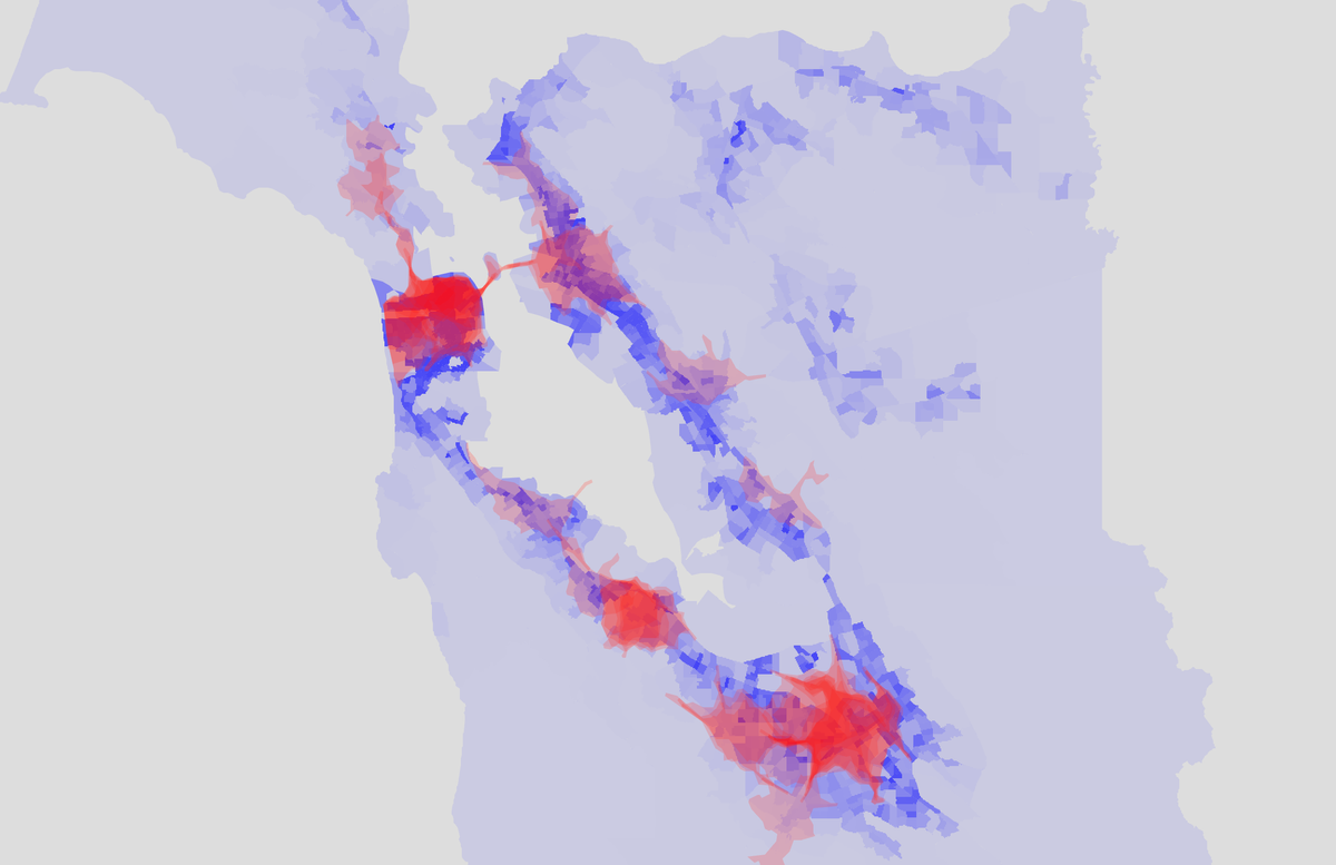
The map below shows population density in blue, and cafe isochrone coverage in red. The darker the blue, the higher the population density, and the darker the red, the higher the number of specialty cafes nearby (from my list of 50).
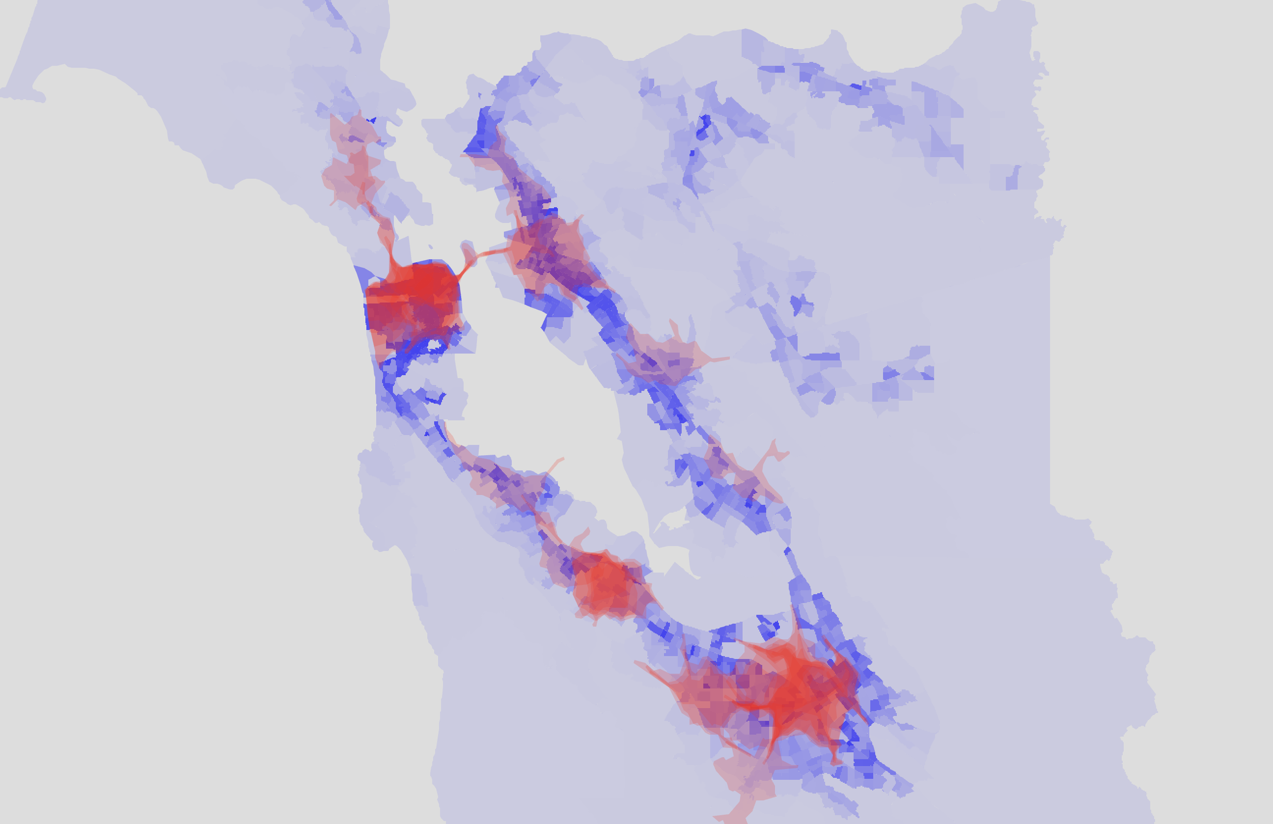
At this point, all I could say is that, from eyeballing the map, the density of coffee shops seemed to be correlated with population density. There are some spots of higher density in the East Bay from Oakland to Hayward that aren't as well covered by cafes, but for the most part, the cafes are in the Bay's major population centers: San Francisco, San Jose, Oakland, and the mid-Peninsula.
But population density isn't the only metric we can get from the ACS data. I wanted to look at income as well to see if there was any correlation between areas with higher incomes and places with more cafe coverage. The Census Bureau estimates that the median household income across the US was $74,580 in 2022 (source). However, most Bay Area counties have a median household income well over $100,000. If you look at the distributions, the income inequality is pretty stark. The map below shows population density in blue and high-income household density in green. For the purposes of this analysis, I considered households making over $200,000/year to be high income. This is the highest income bucket for which the ACS provides data.
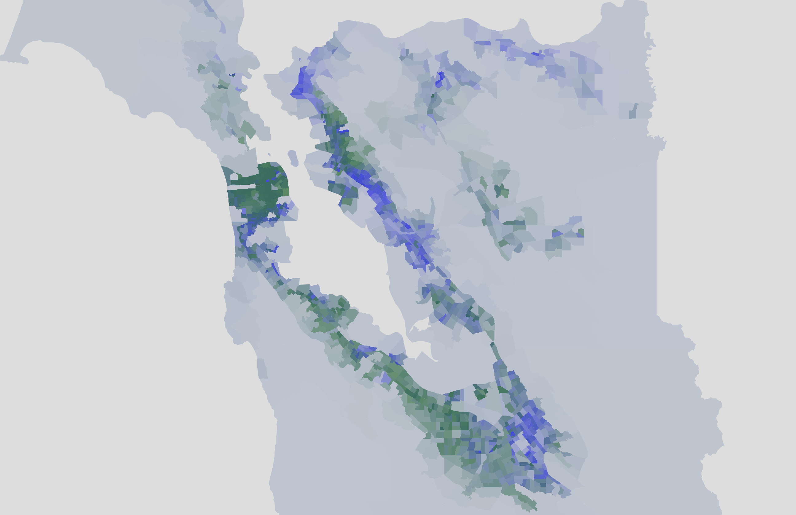
You can see some spots of blue or green that don't overlap much. San Francisco seemed to have a high density of people as well as high-income households while areas up in the hills tended to have a disproportionately high density of high-income households.
Here's the same data, but flipping back and forth in a GIF. Blue is population density, green is high-income household density.
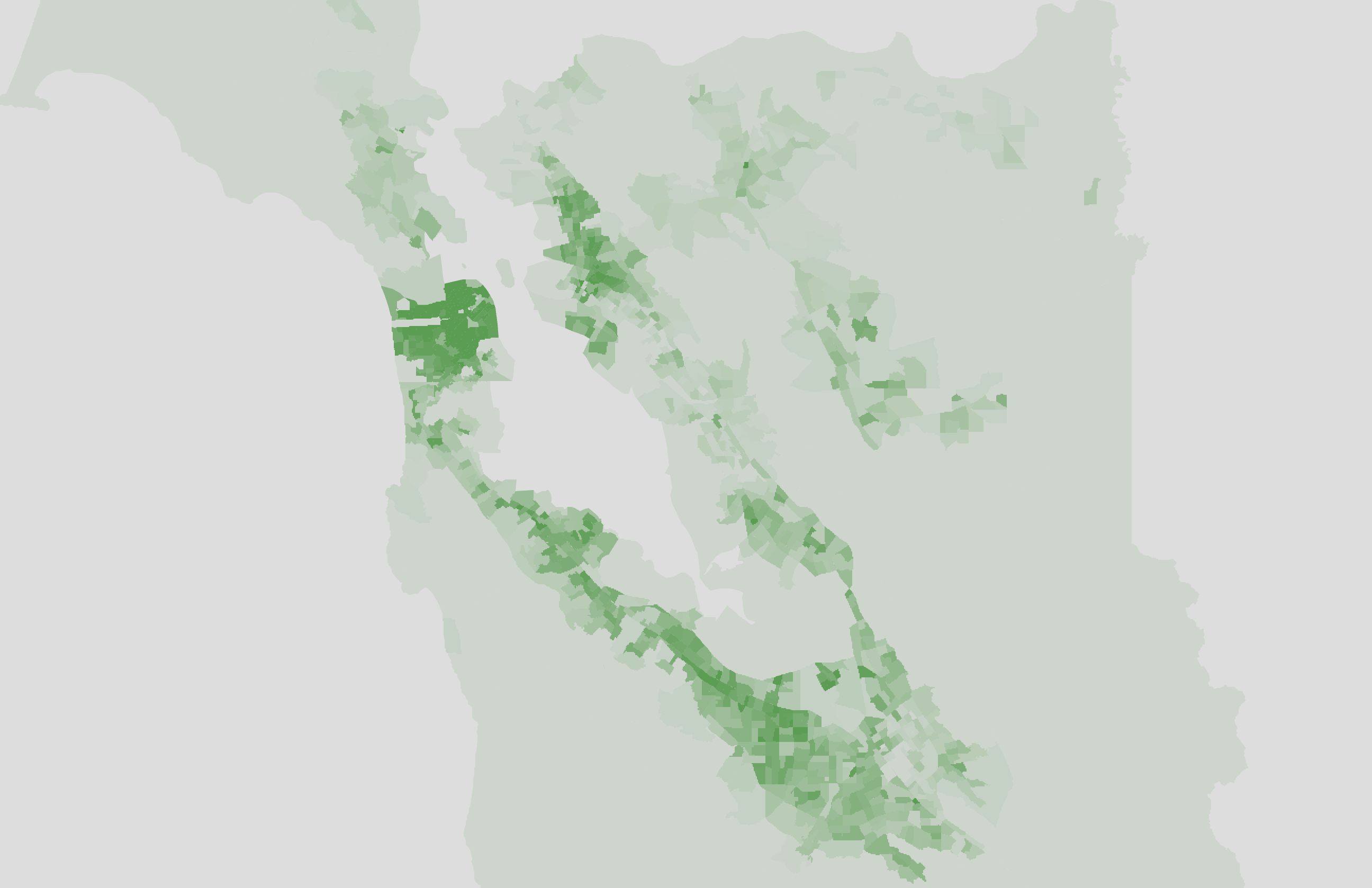
Interesting, but what does this mean for cafes? Let's compare the cafe isochrones to the high-income household density map.
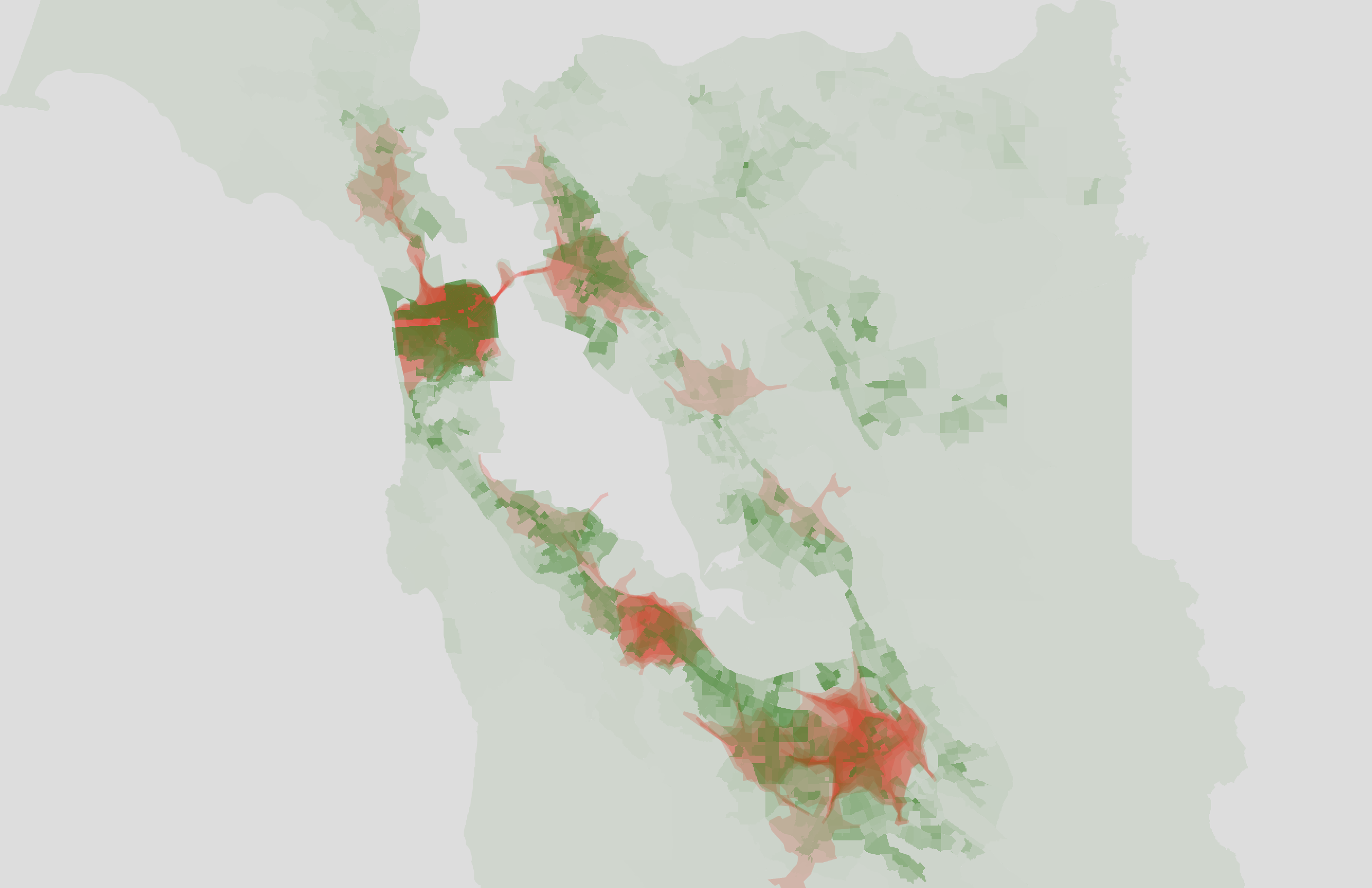
Eyeballing it, I think this matches up a bit better than against the population graph, but only because large parts of the East Bay are excluded.
I would caution against drawing strong conclusions from this map. Like I said earlier, the map is heavily influenced by the list of 50 cafes I picked, and small changes to that list (like including a couple more cafes in the East Bay or Tri-Valley) would make these maps look a lot different.
Wanna Try Playing With The Map?
I don't keep it updated, so consider it an archived version of the map. The list of 50 cafes that I included are not an endorsement. If you want to play around with it, you can find it here (https://coffee-map.ifwego.co/):
A couple pointers:
- The "
census", "zipcodes", and "places" layers show population density. - The "
censusHighIncome" and "zipcodesHighIncome" layers show high-income household density. - The "
zipcodesIncode" layer shows median income by zip code. It's the same color as "zipcodesHighIncome" so be sure you have the right one. - You can click on a census tract/zipcode/place to see stats about it.
- You can enable the "
cafePins" layer and click on a pin to see the name of the cafe and its 10 minute isochrone.
Conclusion
Maps like these might be useful for seeing where existing cafes are, but they don't present a clear picture of supply and demand. It might be possible to infer some data about how many coffee drinkers there are in an area based on the density of chain coffee shops like Starbucks and Peet's that likely have commissioned much more expensive and thorough market research. It's also probable that a roastery-cafe will start to accumulate their own data on where their customers live around the Bay and could use that data to inform where to put a second cafe.
Ultimately, a prospective cafe owner has a lot to consider besides the local demand for specialty coffee. People are willing to drive longer than 10 minutes to have good coffee. If some of those other considerations lead to cafes being closer to their communities than to coffee aficionados, I don't think that's a bad thing.
Technical PS: Using DuckDB
I have a friend who works at Mother Duck who won't stop talking about DuckDB, but I figured since I never shut up about coffee, I could make both of us happy and use DuckDB for my coffee project.
Without getting too into the weeds, DuckDB is sorta like Sqlite, a database engine that can run on your computer or be embedded into other applications. More importantly for me, DuckDB is a data-multitool and query engine that lets you grab data from all sorts of sources (not just databases) like CSV and JSON files and run SQL on them.
I had two data files I needed munged together:
- The ACS data CSV tables containing population and income data by census tract and zip code.
- Shape files describing the outline of each zip code and census tract.
I wanted to get the geometry, population density, and high-income-household density for each census tract and zip code, and output that data to a GeoJSON file that Leaflet could render.
Here's a taste of the DuckDB SQL I used to do it:
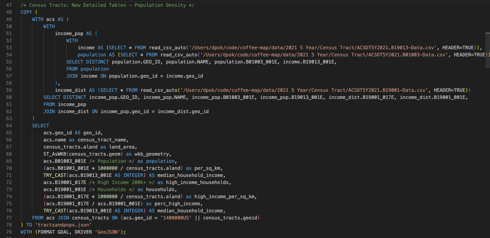
Notice how I'm querying data directly from the CSV files using read_csv_auto(...) and writing it out to GeoJSON using WITH (FORMAT GDAL, DRIVER 'GeoJSON'). I thought it was really cool that DuckDB lets you read and write from files as if they're DB tables.
In the example above, the census_tracts table already existed. It was created by importing geometry data defining each census tract from a "shape file" I got from the Census Bureau. I imported the data into a table so that I didn't have to read it in from the file every time I ran a query. I did the same for zip codes.
Here's an example query that creates the zip_codes table from its corresponding shape file:
/* Import Shapes: Zip Codes */
CREATE TABLE zip_codes AS SELECT
    ZCTA5CE20,
    GEOID20,
    CLASSFP20,
    MTFCC20,
    FUNCSTAT20,
    ALAND20,
    AWATER20,
    CAST(INTPTLAT20 AS DOUBLE) AS INTPTLAT20,
    CAST(INTPTLON20 AS DOUBLE) AS INTPTLON20,
    ST_GeomFromWKB(wkb_geometry) AS geom
FROM ST_READ('/Users/dpok/code/coffee-map/data/tl_2021_us_zcta520/tl_2021_us_zcta520.shx');
Notice how this query parses the geographic data using ST_GeomFromWKB. The functions for reading and writing geospatial datatypes come from the DuckDB Spatial Extension.
I had a good time with DuckDB. Some things I enjoyed about using it:
- It's cool to be able to write a query that joins a DB table with a CSV file.
- There seems to be a lot of support for different file formats like the geospatial shape files and GeoJSON files.
- Considering how much CSV it was consuming and how much JSON it was writing out, it ran pretty quickly. I think it took a few seconds to rebuild the massive JSON blob that I used to power the map.